By Bohdan Vasylkiv
- CEO & Co-Founder
Types of UI Design Patterns Depending on Your Idea
When developing an app it's challenging to decide on which UI design pattern to use, since the list of types is sprawling.
Nowadays, UI and UX design are essential for every business software product development services.
Without them, the usage of every device or software would be unattractive or even impossible. But what are they and why are they important?
UI vs UX. What is the difference?
First of all, why could they be met together? All of us at least once saw the UI/UX phrase. In fact, they are two parts of one process.
UI stands for User Interface, while UX is User Experience. The combination of the UI and UX provides the best final result.
To understand why we should take a look at both of them separately.
User Experience
UX is about gathering data and analyzing it.
It is not only about the personal info of the users, but the way they interact with the product, what issues they struggle with, what is their opinion on how to improve it, etc.
All of this information and acts are done to understand the strengths and weaknesses of the final product.
Moreover, this research is being done not only after the release but during the custom software development stage as well.
It is important to understand, that UX takes care of not only the possible bugs or errors, that could occur but also the usability and response rate, visual perception, and many many more.
So, in other words, UX is about testing the product in all stages, from development to release.
It is done to provide the maximum possible comfort for the end-user, including all their demands and interactions, including even unconscious or not obvious to the user features.
User Interface
The user interface is a visible part of the software, hardware, or other computer-related systems, which is used for interaction.
Actually, it is the means of user-program communication.
UI design defines what exactly the interaction will look like. In fact, it consists of different elements, types, and approaches.
Every application or website, each computer program, or even code-based device uses it.
All of the visual components are actually elements of the UI design.
As a matter of fact, UI impacts not only small visual details but also defines the whole communicational structure of the product both visible and hidden.
For example, each application has a common view, in other words, the way it is supposed to look for the end-user.
Also, they have a command-line user interface, visible only on the coding level, which is used mostly by the dedicated developers. Both of them are UI-based.
Also, it is important to understand that a graphic user interface is not the only possible type of UI.
Frankly speaking, the multiplicity of types of UI is huge.
This amount of variation is caused by the different approaches to using the applications or devices and the constant improvement of their technical capabilities.
It complicates making the correct choice because the specific product requires a reference UI design.
This is why it is better to get acquainted with all the types of UI, before starting the development of your product.
This will help you not only to save time and effort but to, possibly, choose a better method of implementation.
So what are the other types of UI?
Types of UI Design Patterns
At the moment there are 5 major types of UI designs, that differ in the working principles of interaction:
- Command-line user interface (CLI)
- Graphical UI (GUI),
- Touchscreen UI (TUI),
- Voice-controlled UI (VUI),
- Gesture-based UI (GbUI).
Some of them have their own subtypes.
Let’s take a closer look at each of them and find out in which case these types of UI could be used.
Command-line User Interface
 Click to expand
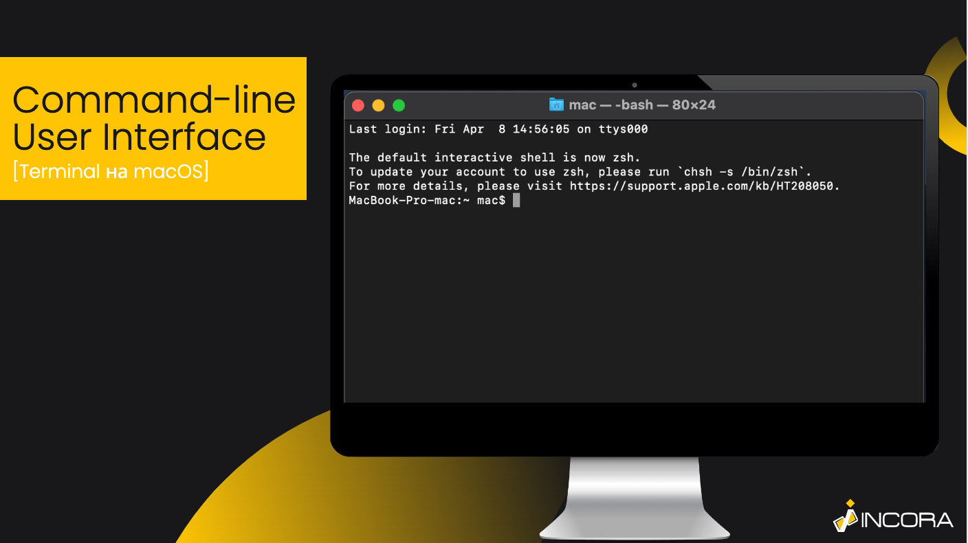
It is one of the first interfaces ever and maybe the most widespread one. It is still used almost everywhere as an interaction tool for developers.
It is a text-only interface, where all the actions are performed by textual commands. The command-line user interface is often used as a basic platform for most code-based projects.
Moreover, most programming apps or programs are created in the command-line user interface as well.
For example, GitHub provides codespaces, as an opportunity to write and check the code online and to present their code as a CV or portfolio for employers or other programmers.
The GitHub website is a command-line user interface, but it is more a hybrid of a console and graphic interfaces.
Graphical User Interface
 Click to expand
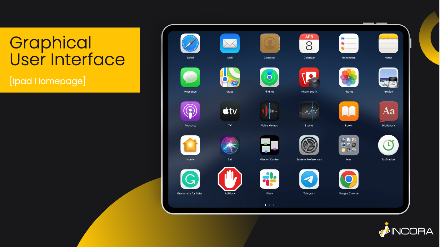
According to the name, the main communication method of this type is visual elements.
In this case, graphic components are triggers of the actual digital processes, so the process starts after activating a button or other UI elements.
So, unlike the CLI, GUI is more user-friendly and allows using all the features without any additional background thanks to the fact, that all the commands are automatized.
Also, most of the graphic components are created according to psychological research in order to simplify the understanding of these icons or widgets and to make their functionality as obvious as possible.
It is sometimes called the “natural user interface”, meaning that using it feels as if it is natural.
Actually, the natural user interface is a very subjective thing, that varies depending on the context of a specific user or group of users.
To create such an interface you will definitely need a lot of UX as well, in order to analyze the specifics of user interactions.
Also, talking about GUI we must say that the variety of UI design approaches, in this case, is the biggest.
For example, when creating a website you have at least 4 different ways to embody the GUI:
- to create a landing page interface,
- a menu-driven interface,
- a Dashboard application,
- or use the scroll telling.
Even if all of these interfaces can exist on their own, it is better to mix them and use them rather as elements of the system, instead of as independent approaches.
Landing Page Interface
 Click to expand
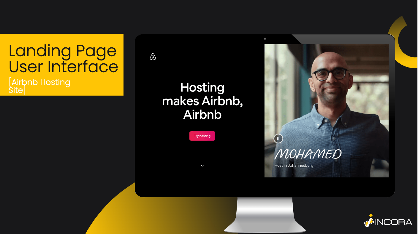
It is when instead of creating a combination of different pages, linked with each other, the software development team simply creates a single-page interface.
In this case, all the information is presented on the same page and could be, for example, grouped by categories, etc.
The main aspect is that the interaction with such a page is limited to one main orientation (vertical or sometimes horizontal) Shadda, one of our recent projects, is a great example of a landing page interface.
Mostly, the landing page interface is used for advertisement or promotion, because it is easier for the user to perceive the information.
This is why it is highly important to understand the key information you want to convey and create a correct order of its essential aspects.
The landing page interface also can exist independently, it can be implemented as a part of a full-fledged website.
Menu-driven Interface
 Click to expand
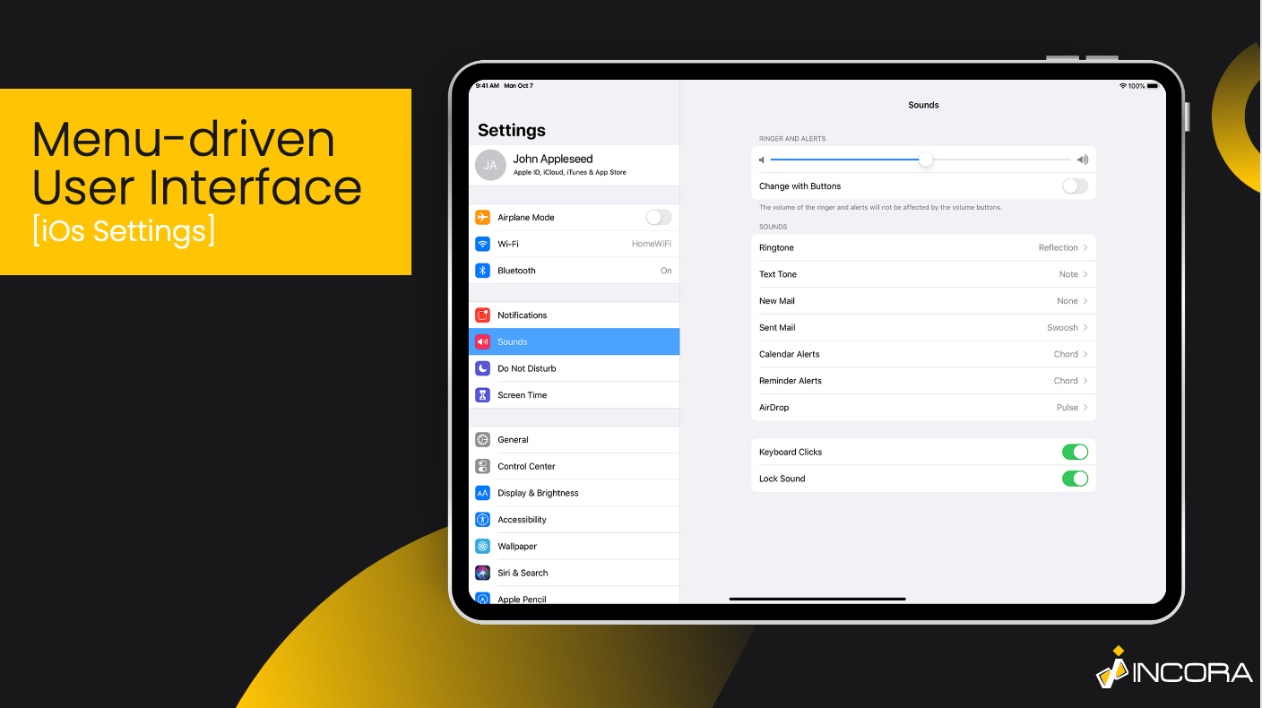
It is the most common GUI design approach. Actually, it seems that there is no need for a further detailed explanation.
In order to simplify the user’s orientation over the website or an app, you create a menu with different rooms of information, actions or multimedia groped by different common features or topics.
Also, there is another possible definition of the menu-driven interface.
For instance, it is an interface, that offers the opportunity to use limited functionality operating the pre-designed list of actions to be done.
The best example of such a case is ATM. When you use ATM - you definitely use the menu-driven interface.
It allows you to withdraw money or top up your account, check your card balance, etc.
Nevertheless, both cases provide you with a predesigned menu or a list of possible features you can choose.
Admin Dashboard Applications
Another example of GUI design is a dashboard.
One of the key features of dashboard apps - is its user-friendly look.
It is commonly used to represent certain metrics and aspects, related to the working processes.
It is a centralized panel, where all crucial business and performance metrics are gathered and visualized.
It is a complex solution, which requires setting countless backend and frontend processes.
Fortunately, it can still be developed even by a single team extension specialist, who is experienced enough.
Scrollytelling and Feed
 Click to expand
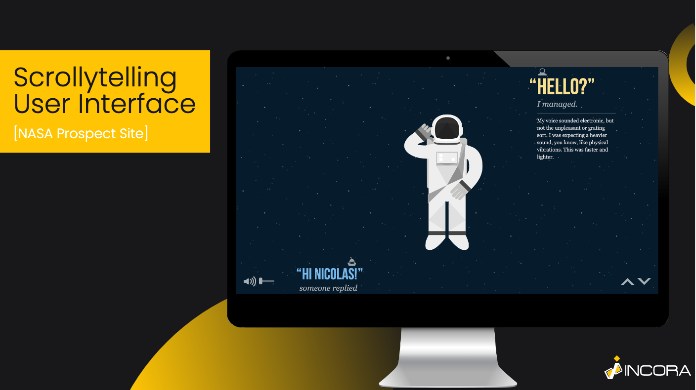
It is mostly used in media or blogs.
Scrollytelling may be also confused as “feed”, but they are different. The principles of its work are easy, as you can understand from its name it is about “scrolling” and “storytelling”.
Usually, it is a single endless page, where all the information is provided.
It is a popular type of UI among social media because it is untrivial at the moment and easily of interest to the users.
It allows making the long-read format interactive.
On the other hand, feed is not actually the type of user interface, but a UI concept.
The similarity between feed and scrollytelling is that they present a lot of information on a single page with almost endless scrolling chances.
The difference is that while scrollytelling provides a logically connected story, feed gives a bunch of different informational content, which can have no actual linkage at all.
Touchscreen UI
 Click to expand
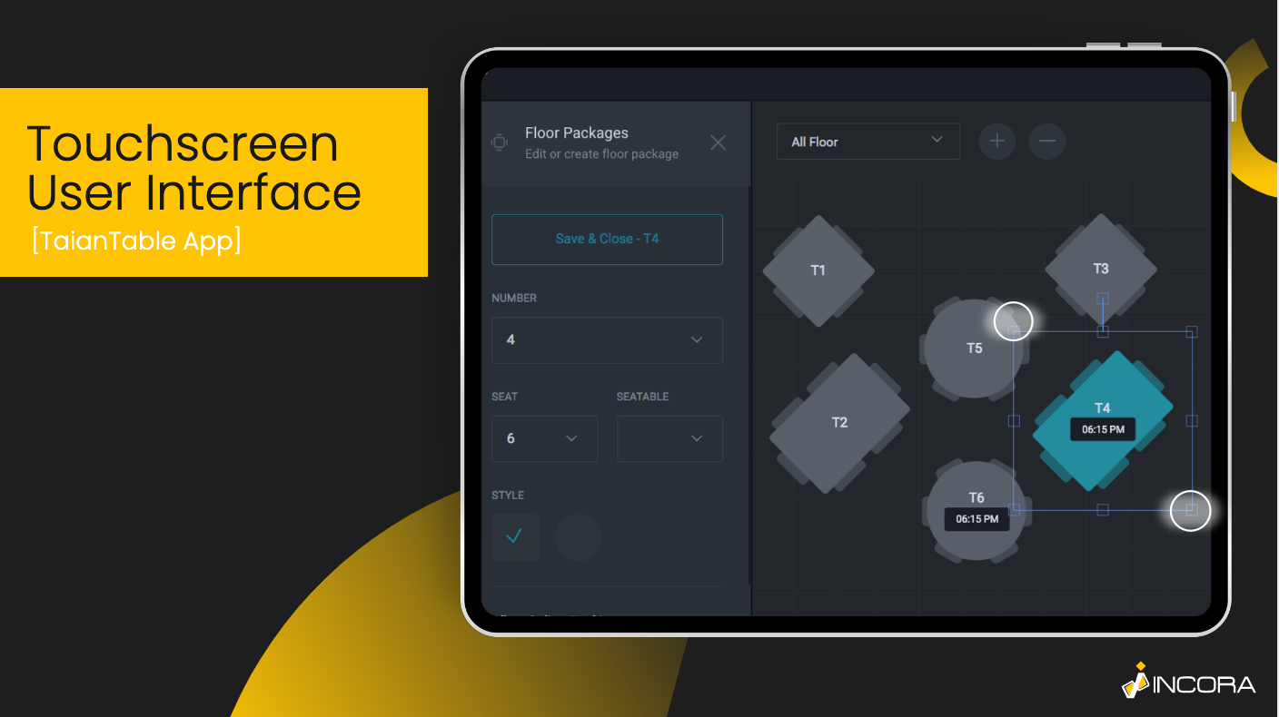
As an alternative to the usual desktop UI, the Touchsсreen one appeared.
Thanks to the growth and rapid development of the mobile sector, as well as the invention of smartphones the need for new UI design patterns arose.
Actually, the main difference between touchscreen UI and, for example, graphical UI consists of the interaction methods.
It is obvious, that Touchscreen UI’s main interaction tools are toches and scrolling, while desktop GUI uses a keyboard, mouse, or other controllers, as well as a virtual cursor.
The main additional benefit of using the touchscreen UI is that it is a more natural user interface.
It is more obvious for most people how to use a touch interaction system, than different combinations of various icons and signs and diverse controllers.
Voice-controlled UI
 Click to expand
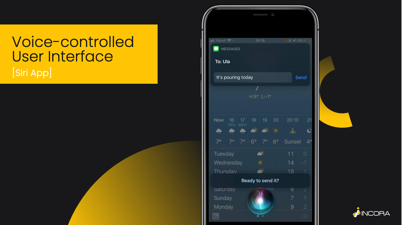
In contradistinction to previous ones, voice-controlled UI has no visual content. Almost all the operations are done using human voice commands.
The system architecture in this case is absolutely different.
Obviously, it would be a crazy idea to choose a voice-controlled UI over the usual graphical one for a website.
Nevertheless, it is how technical revolutions happen. For example, it is a great idea for a website, whose target audience is blind people.
Even though this type of UI does not care about the look or visualization, there are numerous issues to deal with.
For example, one of them is the ability to distinguish voice and commands.
In addition, the problem with language implementation appears, because different languages obviously have different pronunciations, etc.
The list of possible issues related to language distinction is much bigger.
Also, don’t forget about the natural user interface, meaning that commands must be obvious, and easy. It is a great idea to add synonym keywords, so there would be no misunderstandings.
At the moment, this UI is growing its potential. Mostly, it is used in virtual assistants such as Siri for iPhone or Alexa from Amazon.
Most tech giants use this method to create new devices or to improve already existing ones.
As a great bonus, some of such bots are offered as a development platform for third-party companies.
For example, you can upgrade your application using the custom voice technology assistant, based on the Alexa platform.
Or, you can also use ChatGPT integration to build a virtual assistant.
Gesture-based UI
 Click to expand
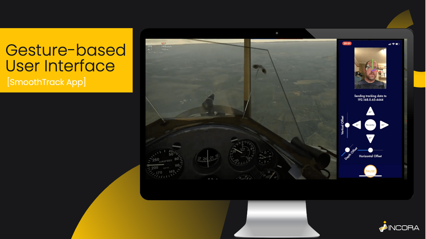
It is another innovative UI design pattern.
It could be embodied in AR and VR technologies.
Such a UI approach allows interactions with fully virtual objects while using additional devices, such as 3D glasses.
Despite the fact, that VR and AR techs are developing slowly, there are a lot of features and opportunities expected in the future.
For example, there are already developing devices like Meta Gloves or the Emerge Wave 1 project, that simulate the shape or texture of the virtual object.
Despite these futuristic prototypes, there is a bunch of devices, that enable using gestures as a full-fledged interaction tool.
For example, the Kinect system for Xbox 360 and Xbox One gaming consoles tracks the movement of the real person and transforms these moves into in-game actions.
Also, the number of VR and AR spaces increased as well. For example, VRchat is a virtually based hub, that allows communication with other users.
The only “but” that applies to gesture-based UI is that it is almost impossible to interact with virtual reality without special devices.
Summing Up
Actually, it is hard to tell exactly which types of user experiences are better for specific purposes. Because all of them are great methods if they are qualitatively designed.
User Interfaces, as well as user experience, are indeed interesting spheres.
The Incora Team has experience in working with UI/UX, so we would gladly inform you of all the possible variations and will definitely help you to choose and develop the ideal UI design pattern for your specific case, all you need is just to ask.
Besides, don’t forget, that most such UI designs demand an experienced development team on board.
FAQ
YOU MAY ALSO LIKE
Get in Touch
Got no clue where to start? Why don’t we discuss your idea?
This site uses cookies to improve your user experience. Read our Privacy Policy
Accept
