


By Tetiana Stoyko
- CTO & Co-Founder
How to Design a Dashboard Feature for Any App?
What is the Dashboard feature, what types of such apps exist, and how to design a dashboard for any app?
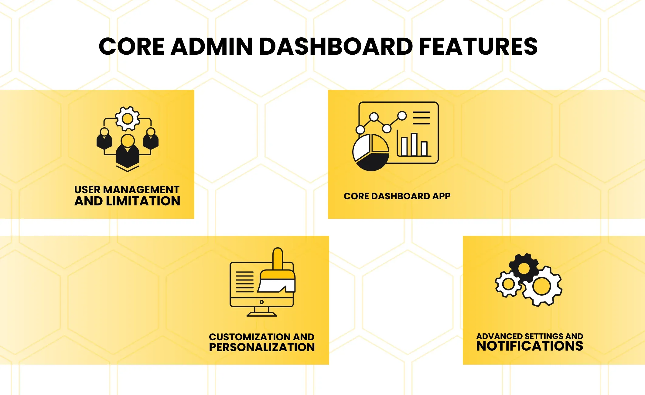
Previously, we have already discussed the importance of the admin dashboard app, as well as examined some of the key features for such type of software.
Nevertheless, having a toolkit is just a part of the custom dashboard development process. As a matter of fact, fine user experience is critically important for any management software. Yet, the convenience of UI elements can significantly impact the overall efficiency of using your app, when it comes to the dashboard.
So, why is user interface so important for this type of software, and how to design an efficient dashboard feature, that will be suited for any other application, regardless of industry or usage purposes?
Interactive Dashboard Feature Explained
To cut a long story short, the dashboard feature is an app functionality, designed for specific purposes, which is commonly used by a limited number of users(mainly - admins).
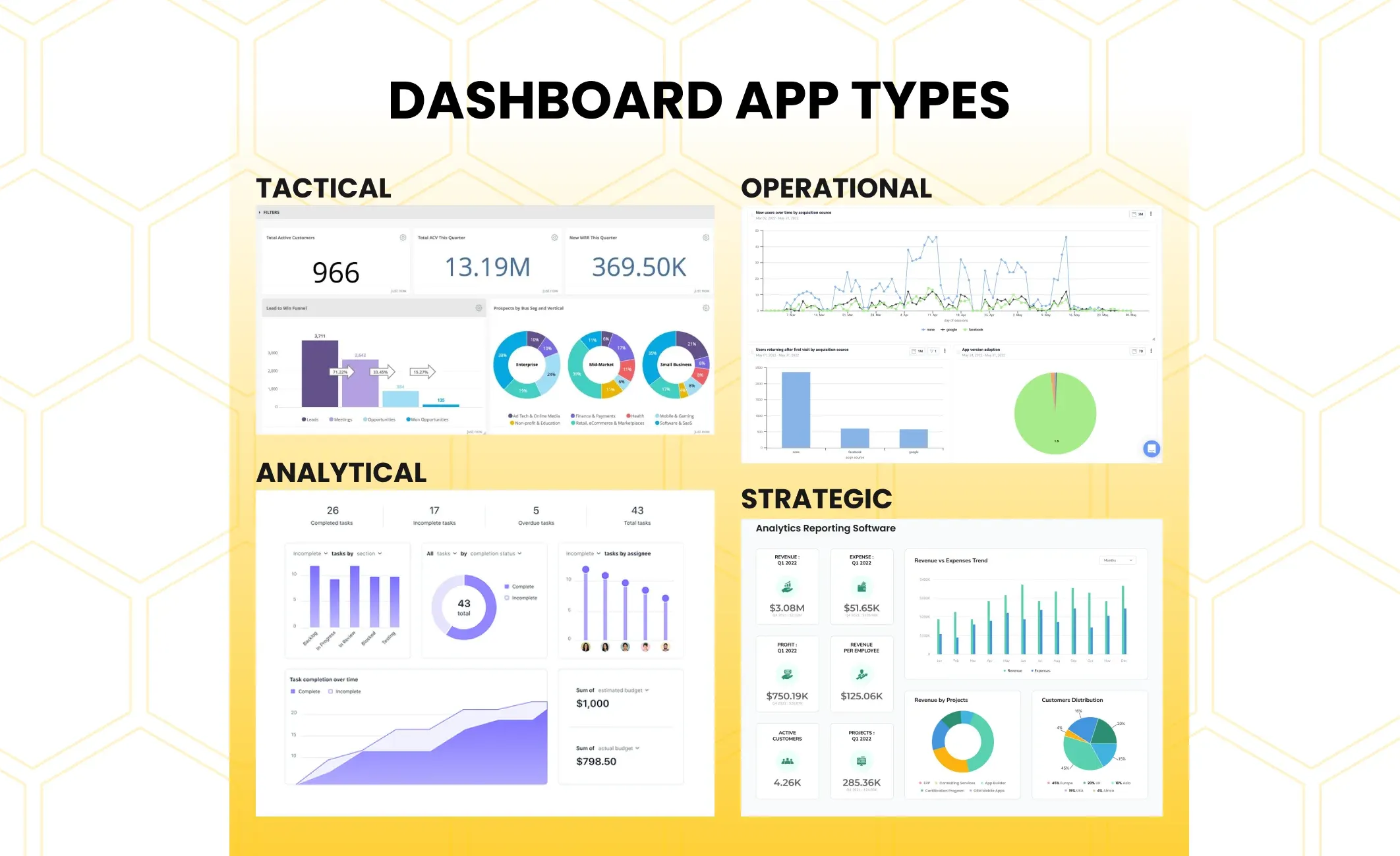
The analytical dashboard feature is designed to provide business employees with several instruments, which are mostly aimed at infographics and data analysis. In other words, dashboards are used to analyze certain business metrics and to visualize them more conveniently and clearly, so that business analysts have more convenient tools for doing their job.
 Click to expand
Besides, types of dashboards can vary, depending on the goal and scale of analysis to be done. For instance, it can be an operational dashboard for small-scale or short-term projects, or a strategic dashboard for enterprise-level businesses, which is used to track numerous business processes, evaluate their performance metrics, and identify what should be improved.
Eventually, it is essential to make sure you choose a dashboard that meets your requirements and expectations. Just like in the case of any other software solution, you need a certain powerful tool for particular circumstances: clearly, you won’t use a screwdriver to drive a nail.
Yet, unlike traditional tools, the dashboard is a slightly more difficult concept, which makes it harder to better understand when to use its particular variation. This is why the first step in designing your dashboard feature - is to define what scale it is oriented at, as well as a wide range of other aspects. The best way to make an informed decision and perform the correct estimation - is to contact a niche-experienced development company to discuss and plan the development process.
Benefits of Dashboard MVP
Frankly speaking, one of the most effective ways to design and develop a high-quality product is to start with MVP.
 Click to expand
To rephrase it, whenever you are starting a new development project, the best way to do it - is to start small. Minimum viable product is a concept, which primarily states that at the very beginning, you will need only the most basic version of your application.
This idea helps not only to cut time and expenses on product implementation from scratch to going live but also allows gathering essential data and performing market analysis, learning your target audience, and better understanding its needs and expectations.
Ultimately, when you choose developing an MVP over your “ideal concept” with all the features you would like to see in your final product, you will get a chance to deliver the best possible result, by giving your developers fewer tasks and more time for the development and product optimization, i.e. your dedicated team will have more time to polish those few features, as well as to try different configurations and test which is the best one.
Standalone Dashboard App vs Integrated Feature
Another important informed decision is whether you want to create a standalone dashboard application, which can later be integrated into other software products as an API or with the use of alternative integration approaches, or you are willing to develop a dashboard feature on top of an existing service or software app.
At first glance, it seems that there is almost no difference between these two approaches, apart from their nature.
On the one hand, it is partly true: both solutions will perform the same tasks and their toolkit can be the same.
Truth be told, distinctions between them are not as simple and obvious at first, yet you will notice them afterward, after trying each such dashboard solution. Still, there is no “right” choice, each of the approaches has its pros and cons.
In either case, you will need to define a few major aspects before you will choose the development approach. Fortunately, they are almost the same for each scenario. Therefore, to develop an efficient dashboard, regardless of its nature, you will need to define:
- Data Sources: Dashboard is a data-driven solution. Therefore, one of the most important aspects in such software creation - is to define from where and how you are going to gather your data. It includes not only data types or potential sources but also the way will you crawl needed data from them. One of the easiest and most popular ways to do so - is to develop a crawler bot, that knows what and where to look for.
- Database to store info: Another important aspect is to define where you are going to store your data, whether it is going to be a third-party cloud solution or a traditional database. If database, then what exact type of databases to use between SQL and No-SQL and why?
- Data visualization ways: You will need to consider how to transform your data and make it possible to easily visualize it. One of the most popular ways to do so - is to adopt a ready-made business intelligence solution via API, due to the fact, that such software is not an easy task to do. However, of course, you can also consider the possibility of developing such tools from scratch to have even more control over your dashboard.
- Development and Deployment tools: Clearly, among technical requirements, it is also important to define the tools you are going to use during the development itself and how exactly you are going to deploy your final product. While development tools like frameworks, libraries, or even programming languages can differ, depending on numerous aspects, starting with the nature of your dashboard (app or integration), and ending with the preferences and expertise of your software development team. At the same time, one of the easiest and most common deployment ways is to choose a ready-made cloud-based SaaS solution like AWS.
- Security measures: Data is a vulnerable and important aspect, which is a key to success. Therefore, as with any other product or software, it is important to ensure a high level of security. Potential security measures start from dealing with the OWASP list and end at the point, where you design a security architecture, define the credential and access levels, etc.
- Maintenance and support plan: Finally, you have to plan your steps on what to do after the product deployment. Among the most crucial aspects to take into account, it is possible to name bug hunting, create at least an approximate update schedule and road map, and define the maintenance principles.
Standalone Dashboard App
Talking about the full-fledged app, it is hard to deny the fact, that it will most likely be more powerful, providing a more seamless user experience.
Besides, it can be significantly upscaled and provide better customization capabilities for each user.
To add some more, having a full-fledged dashboard application means, that you will be able to integrate other services or features into it to expand the app functionality capabilities and increase the collaboration with third-party solutions.
Nevertheless, developing an application is much more resource-intensive and will require niche-experienced developers, as well as more time and materials.
Eventually, you will also have to spend money to maintain the application even after the development process is over, perform bug hunting, optimize an app, improve security to ensure at least the OWASP list, etc.
Built-In Business Dashboard Feature Solution
As an alternative, in cases when you have a limited number of key business metrics to take care of or have limited resources, you can choose to develop a dashboard as a part of an existing app.
In such a case, you will still need a team of software engineers with some proven experience in working with such technologies. Nevertheless, the overall development process will be easier and faster due to the fact, that there is less work to do: instead of developing different parts of an application, you will need to design and create a single feature.
In addition, the maintenance process will be much easier and cheaper for the same reason.
Plainly speaking, regardless of how complex your admin dashboard panel will be, in most cases, it will be much simpler than a standalone application with the same functionality.
However, this software's simplicity also brings some drawbacks as well. For instance, it will have fewer functional features to present or may lack performance, compared to a full-fledged standalone application.
Clearly, a standalone dashboard application will eventually show much more complex and scalable functionality, as well as better customization options and overall performance. Still, all these advantages have their price to pay for.
Dashboard Design Best Practises
Fortunately, the design patterns are similar for both the standalone app and built-in dashboard feature, i.e. regardless of your dashboard’s nature, most steps and approaches are going to be the same.
In most cases, design pieces of advice are very general, yet worth mentioning, due to the fact, that despite their apparency, many people still forget such key design principles for effective data visualization.
First of all, use already tested design patterns, that have proven their efficiency and keeping up with simple and intuitive interfaces. The main goal of your dashboard software is to help users better navigate data and visualize it so that the business team understands the current situation with different metrics.
Prevent Information Overload
Therefore, the best way to improve the UI/UX design is to hide all extra features or interactive elements, keeping the home page as clear and informative as it can be.
This includes not only the interface itself (dashboard buttons, bars, other UI elements) but data visualizations itself as well.
Each dashboard grows with time. It also includes growth in data arrays and data types. So, one of the best ways to keep your interface informative and clear - is to enable different tools for data management.
For example, there can be different sorting options, which allow individual users to choose which data type to display or hide, instruments to edit the visual representation of key metrics (make a graph bigger or smaller, relocate it, etc), filtering or pagination are also among core features to deploy.
Context and Historical Data
Apart from real-time data, dashboard apps have to deal with historical data as well.
This is a basic functionality, that defines the overall dashboard efficiency and enables certain use purposes like data analysis and various predictions, etc.
To make it useful and avoid information overload, it is better to make historical data reachable in a standalone tab or window, apart from the core informational dashboard. Alternatively, you can add a way to turn historical data visualization on/off. So, if needed, it can be easily reached in one click, still not being there all the time to keep the attention to the most recent data analysis.
Customization and Personalization
Finally, do not forget about your employees’ needs.
One of the most important aspects of any dashboard tool is the fact, that most of them are highly customizable, giving the analysts the ability to adjust their working dashboard to meet their needs and according to their preferences.
As a result, it significantly decreases the possibility of human factors, which is a common phenomenon, when it comes to working with big data.
Also, enabling customization and personalization options automatically takes care of the previous two recommendations.
Dashboard Feature for Any App with Incora
Despite the chosen path: whether you are going to develop a standalone dashboard application, or are willing to create a built-in dashboard feature, you will need a dedicated team of developers with proven experience in working with such type of software.
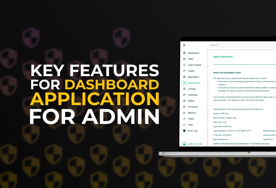
For instance, our Incora team took part in developing a few different dashboards. Among the most recent cases, it is possible to name Arizto, an online dashboard for real-time real estate monitoring. Alternatively, we can name many similar projects for each industry we worked in:
- UniShift, an educational platform with a built-in dashboard feature for better information management
- An application for the healthcare field to make doctor appointments, conduct online consultations, and save historical medical data
- A Shipping Flow management system for the Logistics sphere, and many other examples of applications with built-in or standalone dashboard features.
Frankly speaking, one of the major advantages of any dashboard is its industry-agnostic nature, meaning that most such software instruments can be easily integrated into any field with just a little or even with no changes at all. So, almost any dashboard is suitable for nearly any application.
Therefore, instead of thinking of compatibility, it is better to consider how to develop a high-quality software product, that can show great performance and key features to perform tasks, it is designed for.
If you are looking for more detailed information - you are always welcome to contact us.
Additionally, we highly recommend you examine some of our recent case studies, to have a better understanding of what our background is.
FAQ
Why is a dashboard important for an app?
A dashboard serves as a centralized hub that provides users with a quick overview of key information and features within an app. It enhances user experience by presenting data in a visually appealing and easily digestible format.
What should be the primary goal when designing a dashboard?
The primary goal is to provide users with relevant and actionable information at a glance. The dashboard should be user-centric, displaying key metrics, alerts, or tasks that align with the app's purpose and the user's needs.
How do I identify the key metrics to display on the dashboard?
Understand your app's objectives and user needs. Conduct user research to identify the most important information users want to see regularly. Collaborate with stakeholders and consider industry best practices to determine the essential metrics.
What elements should a well-designed dashboard include?
A well-designed dashboard typically includes:
Key performance indicators (KPIs) Graphs and charts for data visualization Quick access to essential features User-friendly navigation Customization options for users
How do I ensure the dashboard is visually appealing?
Use a clean and consistent design with a limited color palette. Ensure readability with clear typography and appropriate spacing. Utilize visual elements such as icons and charts to make information easily understandable. Maintain a balance between aesthetics and functionality.
Should the dashboard be customizable?
Yes, providing users with the ability to customize their dashboard enhances the user experience. Allow users to arrange and prioritize widgets based on their preferences, ensuring the dashboard is tailored to individual needs.
How do I ensure the dashboard is responsive and accessible?
Design a responsive layout that adapts to different screen sizes and orientations. Prioritize accessibility by using alt text for images, providing keyboard navigation, and ensuring compatibility with screen readers. Test the dashboard across various devices to guarantee a seamless user experience.


YOU MAY ALSO LIKE


Get in Touch
Got no clue where to start? Why don’t we discuss your idea?

Just pick a time. No forms.


This site uses cookies to improve your user experience. Read our Privacy Policy
Accept